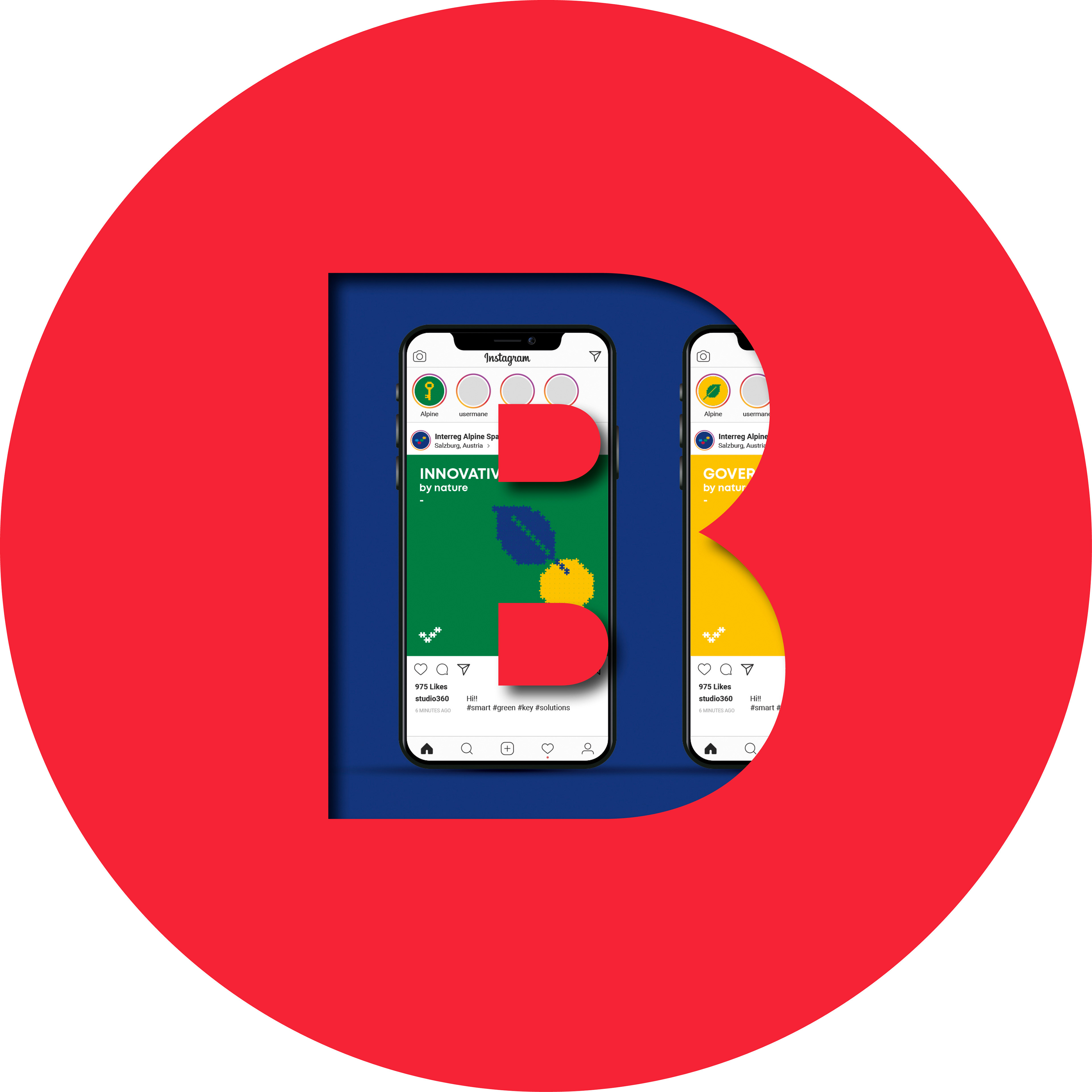
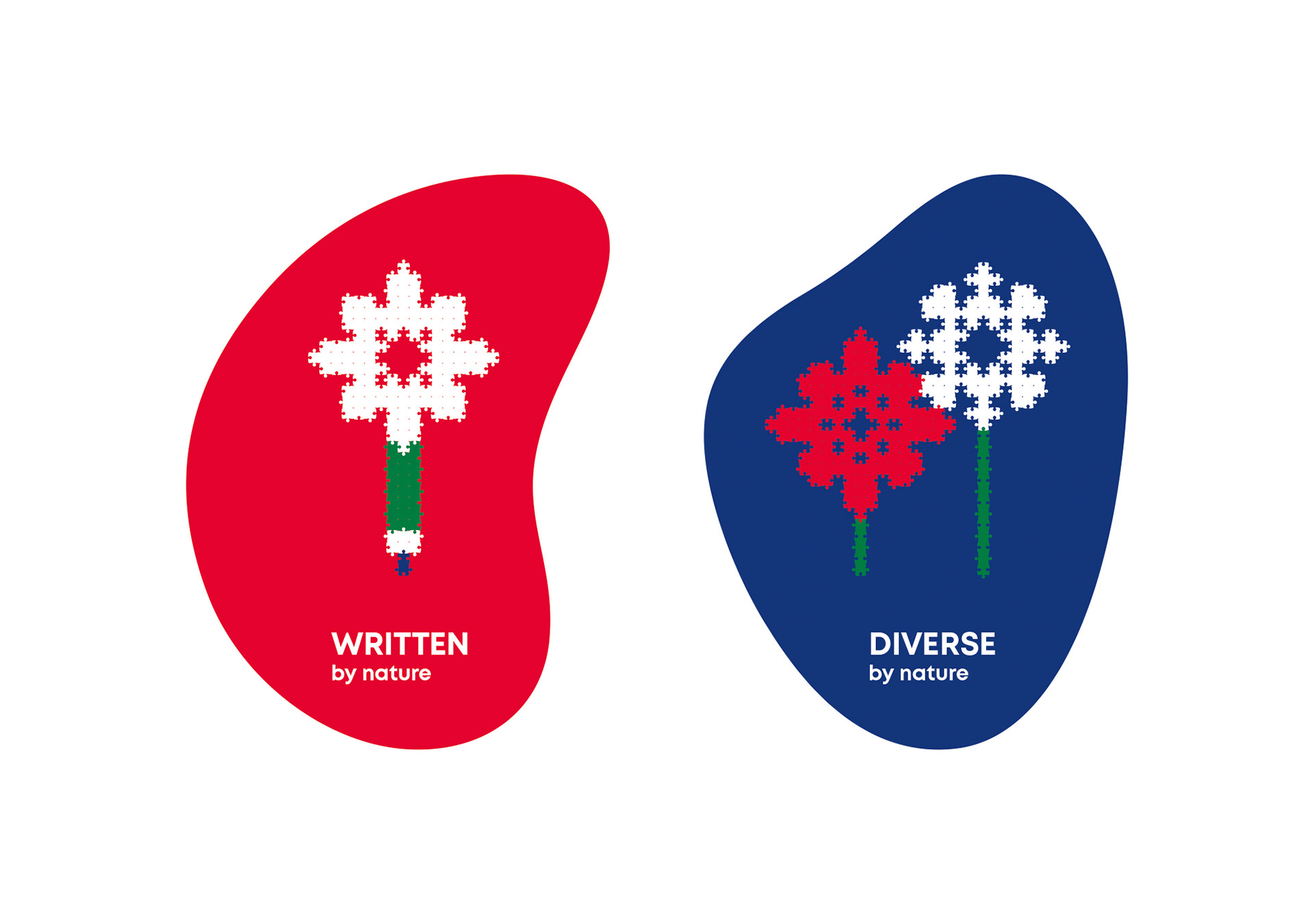
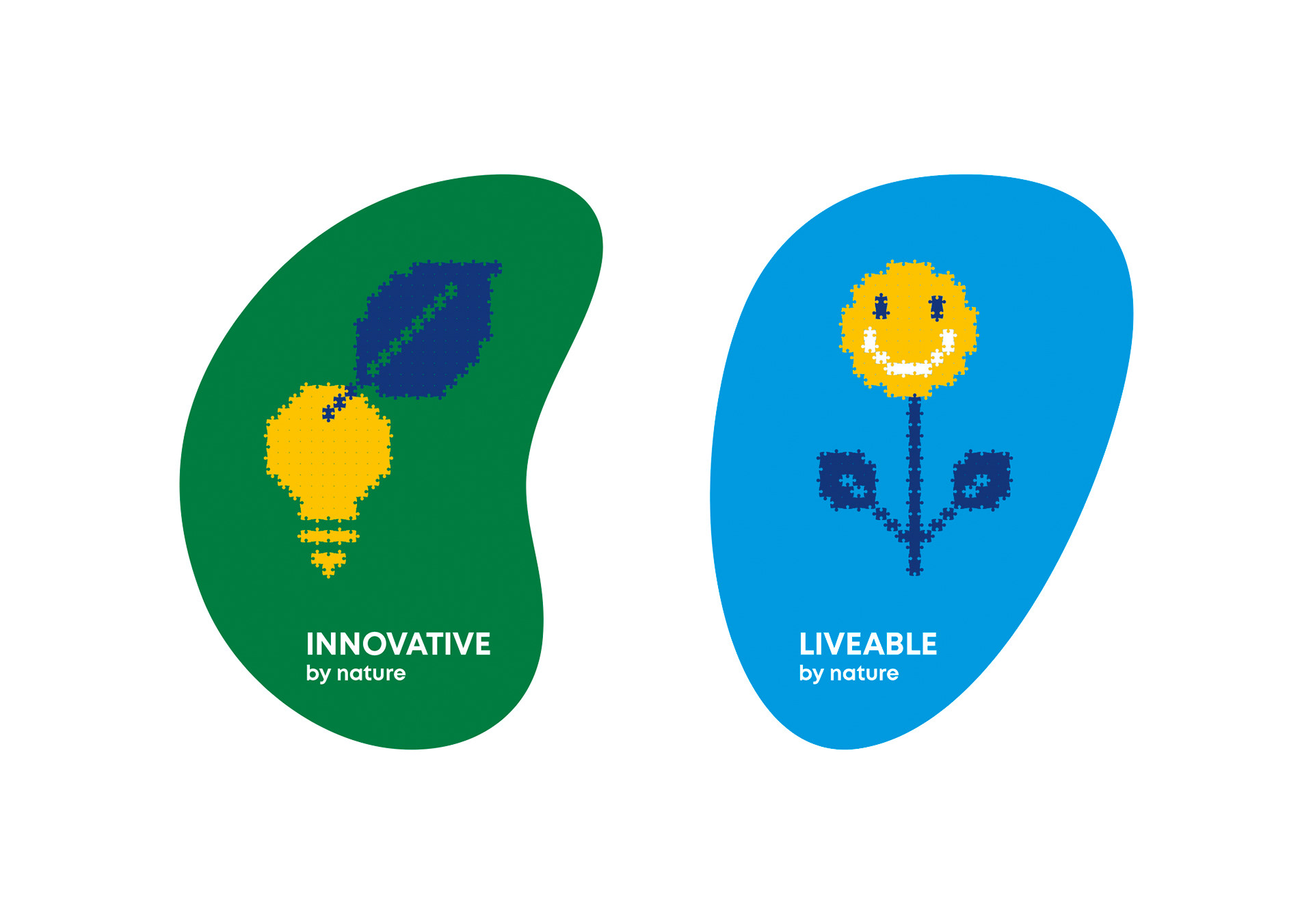
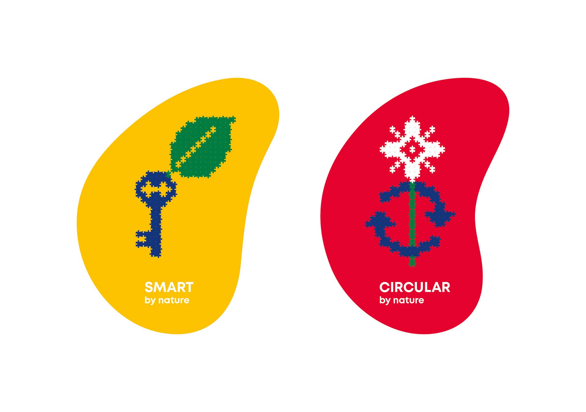
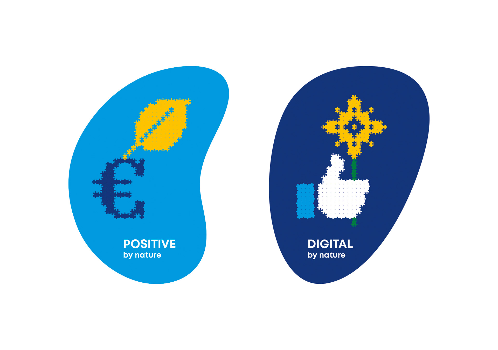
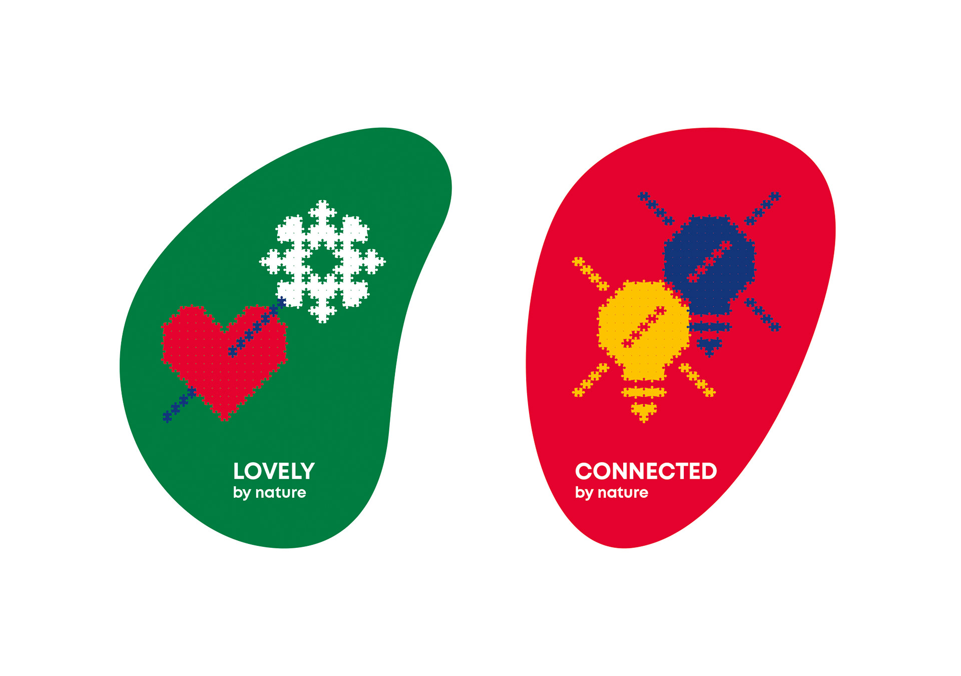

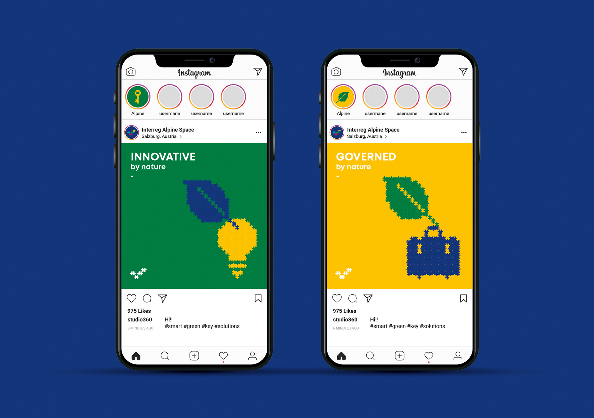
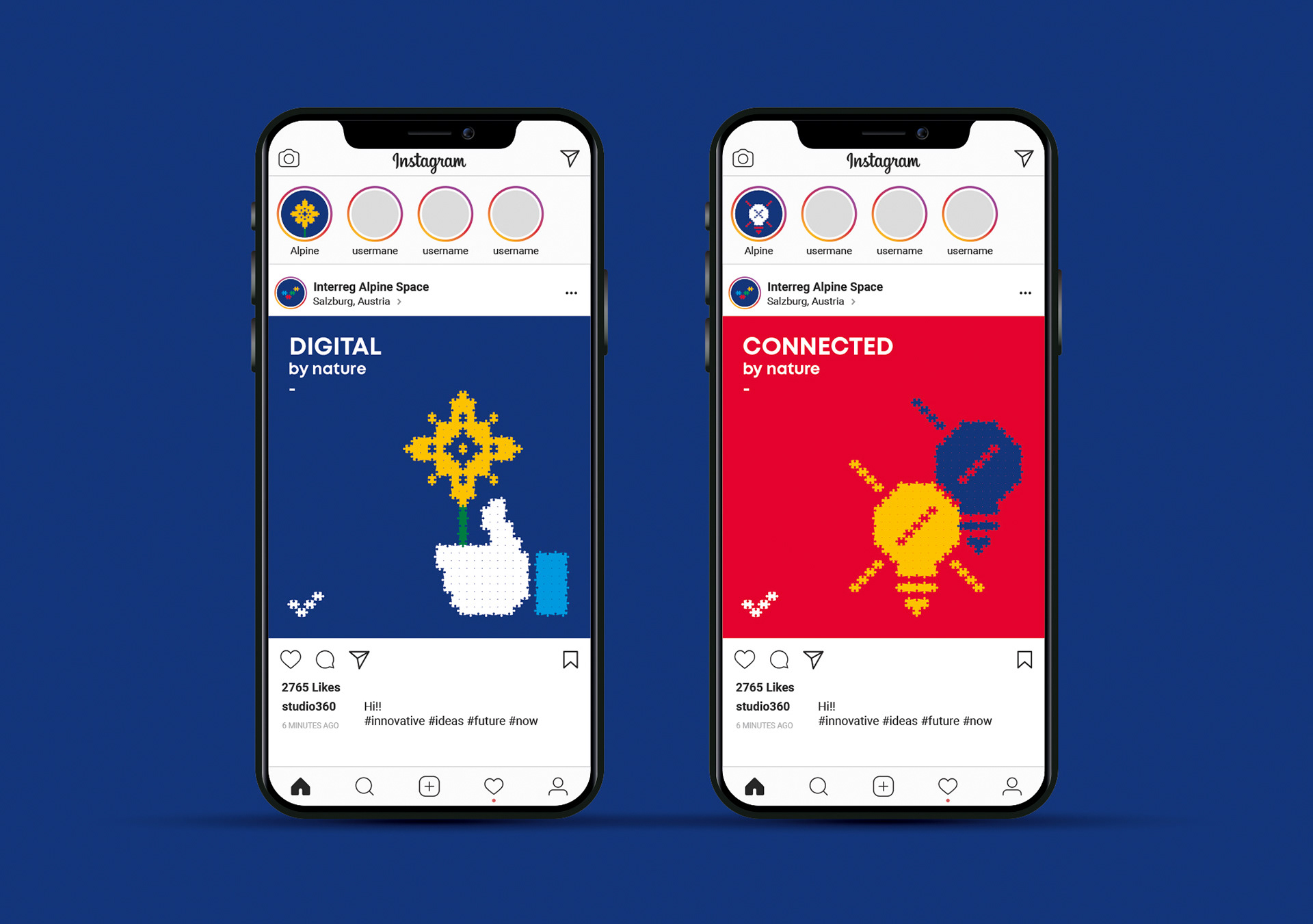
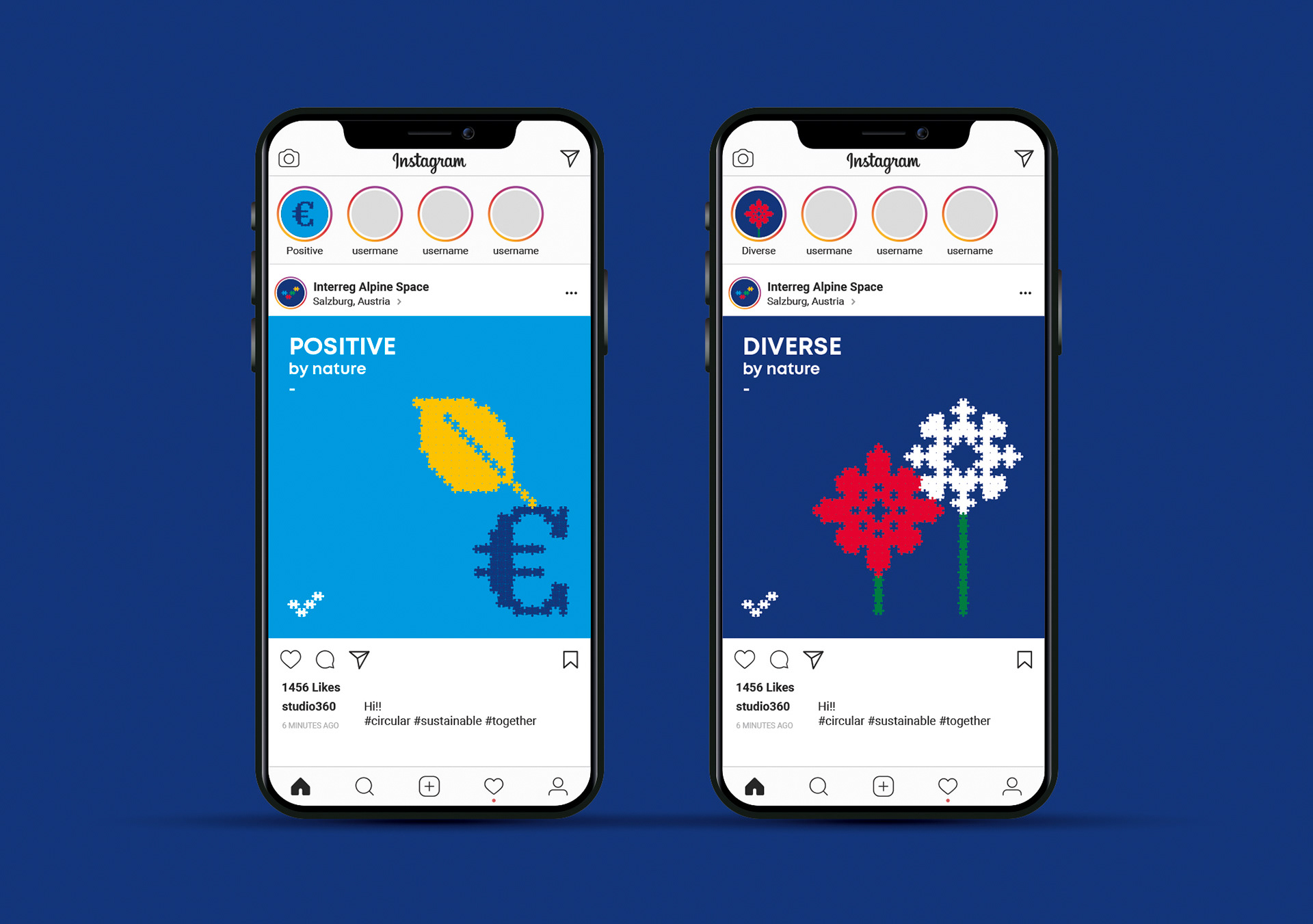
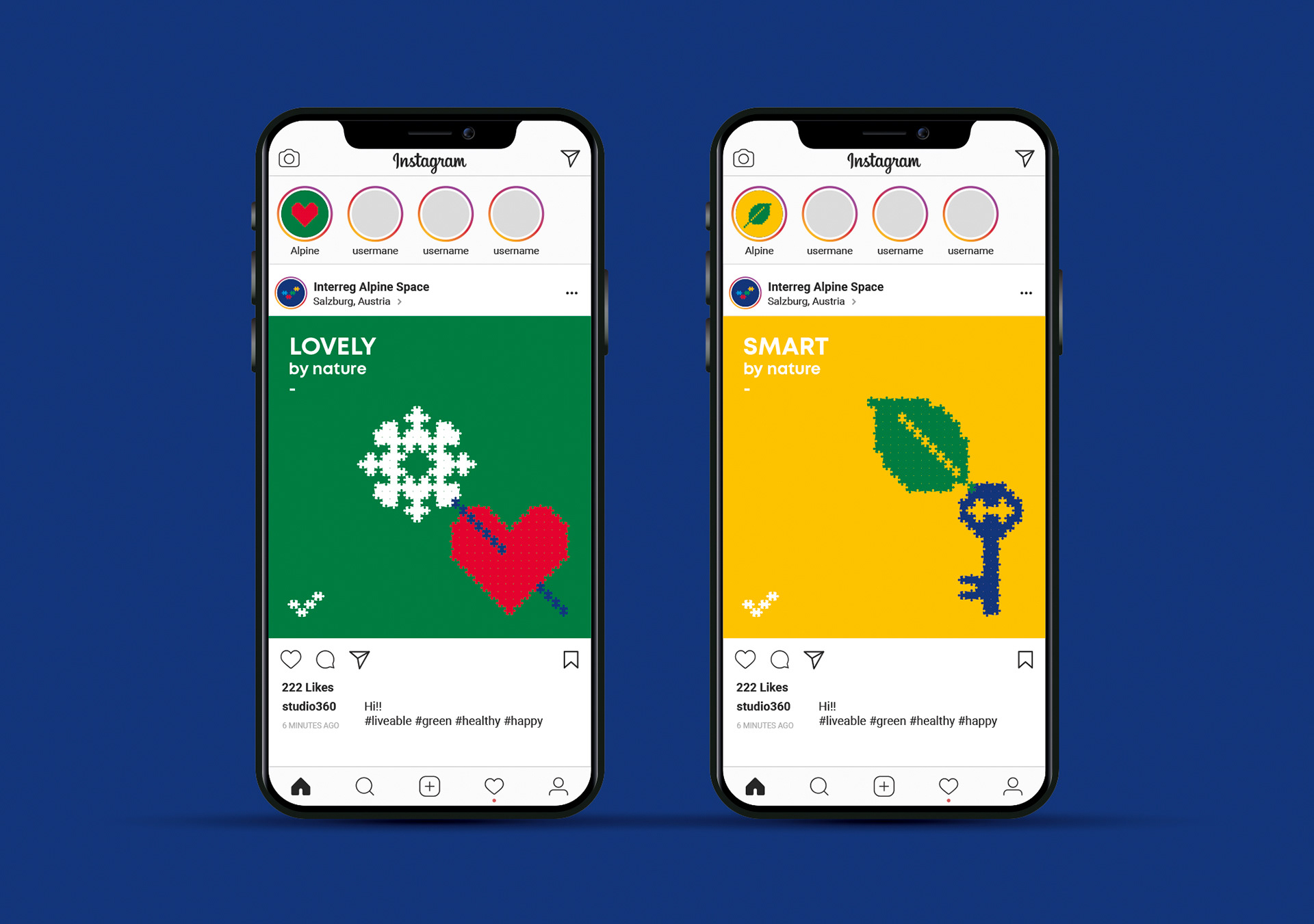


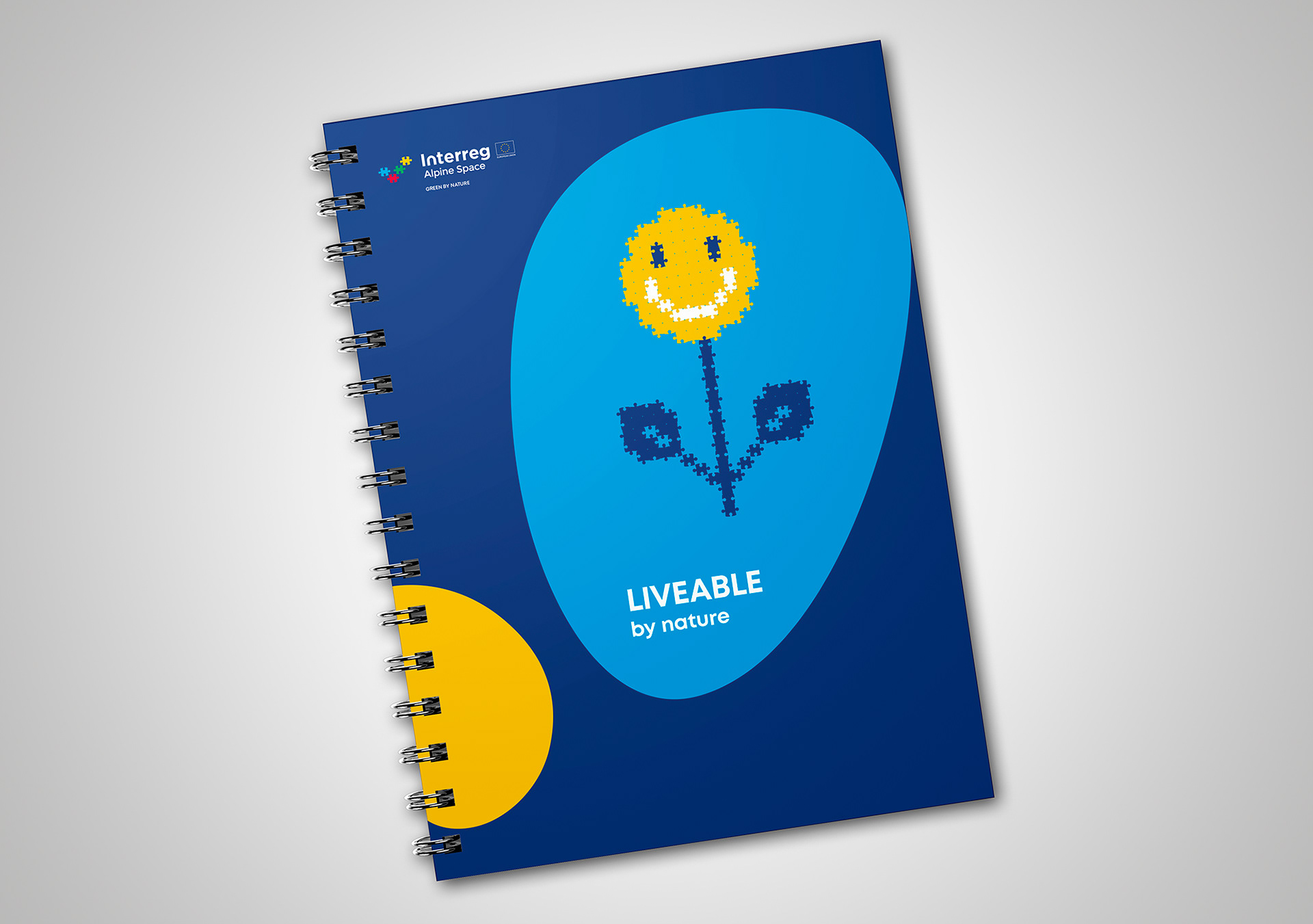


Every individual is a building block of a larger community and every single action a piece of a greater effort. This is exactly what Interreg Alpine Space stands for: enabling a broader picture through a well-organized process of collaboration between different EU stakeholders and countries. There is no better way to implement this idea than using building blocks as a visual metaphor. In order to communicate brand values and the official EU development strategy, all the graphics consist of two basic elements: puzzle pieces and topographic-map organic shapes. Many of them, one by one, are implementing the big picture of the Interreg Alpine Space: becoming green, healthy, sustainable and digital.